

Total Value Scorecard
Reframing the idea of a bargain
Celebrating the Banking Relationship
When JP Morgan Chase wanted to increase annual fees for one of its credit cards, there was concern that cancellations would rise. However, research showed that most users were willing to accept the higher costs, as long as they knew they were getting more value than they paid.
We had an opportunity to strengthen the banking relationship by simultaneously reminding them of how much they’ve gotten out of their credit cards, while also showing them how else they can get more value from their cards. This was the first product of its kind and it won us the Banking Tech Awards USA’s Best User/Customer Experience Initiative award in 2025.
Role
App Design, User Experience Design, Animation, User Testing
Team Members
Krystle Tang – UX Design
Karina Campos – Research
Aracelli Linderman – Content Design
Madeline Krone – Content Design
Category
Finance, Credit Card, Loyalty
Duration
Q3 2023 – Q1 2025

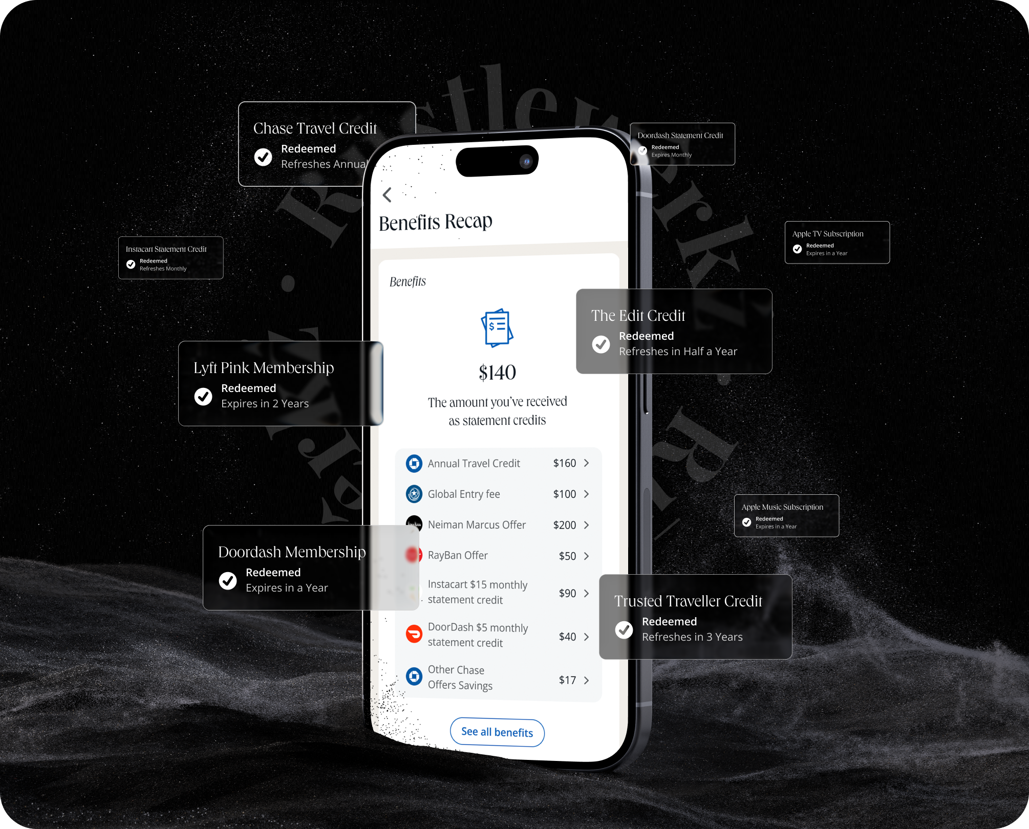
Determining “Value”
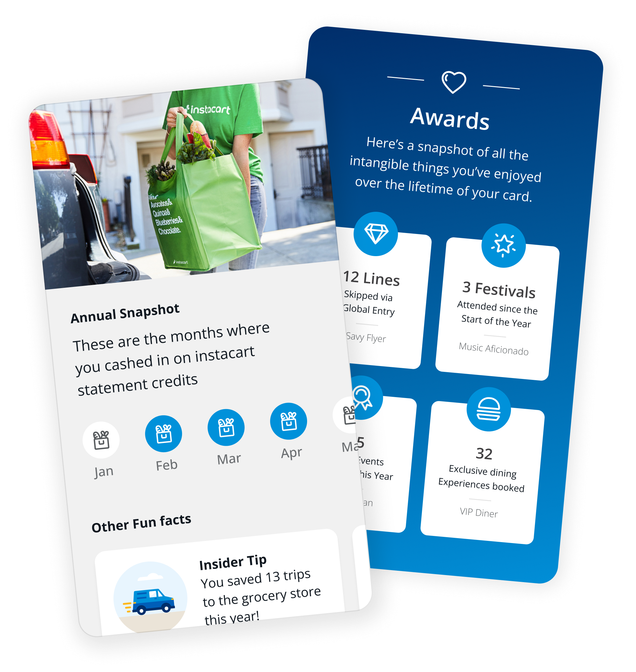
Surprisingly, it wasn’t easy to quantify the value a user gets from their card. Each user valued different things, including things which were intangible, like the convenience of an airport lounge or exclusive access to events.
Some also felt that the values in our marketing material were inflated and that they didn’t feel “real” to them personally. We had to carefully balance the needs business with the needs of our customers. By bringing greater transparency to this banking relationship, we believed that users would be able to justify their credit card expense.

The Job to be done
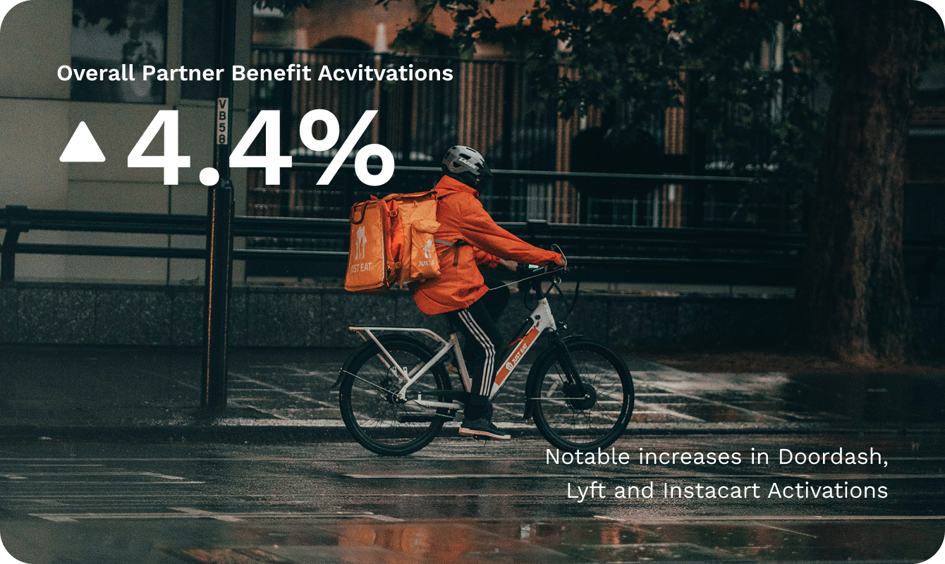
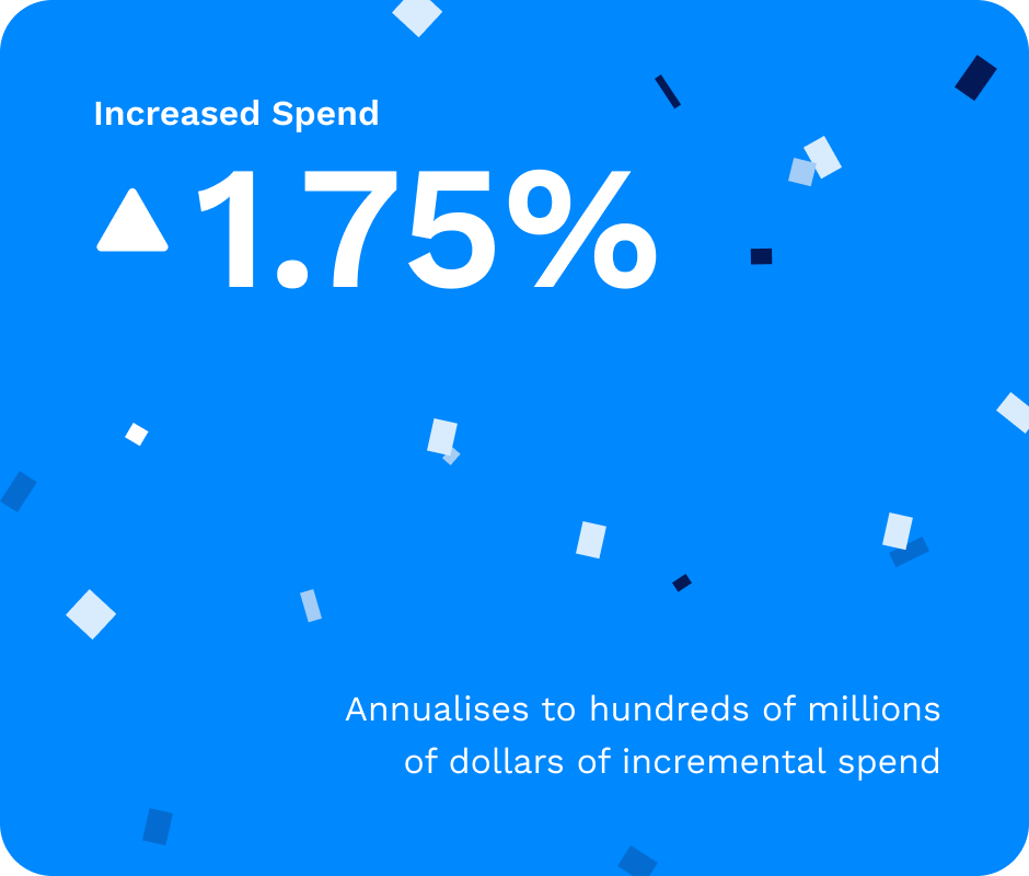
Because of the complex nature of their cards, many customers tend to undervalue their benefits. These benefits refresh on a monthly, quarterly, or yearly cycle. It makes it difficult for users to keep track of what benefits they’ve used.
While these amounts may seem small at first glance, they become significant when tallied over a year. We wanted to empower customers to easily learn and track the market value of their benefits.
Keeping it Simple
Initially, we also attempted to include the intangible things. However, due to tech limitations, we could not account for every use case. Legally, we were required to include numerous disclaimers and terms & conditions.
This made the experience very complex, and we ultimately decided against their inclusion. It was a constant balancing act of providing customers with enough information to keep them engaged, while not overwhelming them with overly complicated details.
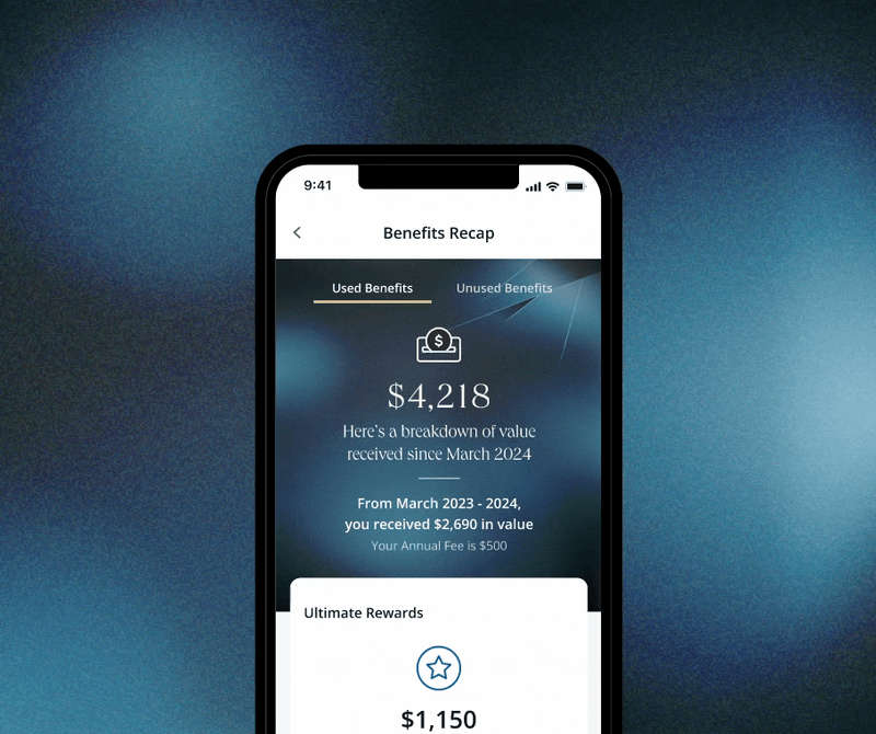
Unused Benefits
Testing also revealed that users were more interested in unused benefits than the ones they’ve already used. They were worried about missing out on value, which they felt that they’d already paid for.
We created a separate tab for them to easily view their unused benefits and made each link actionable.
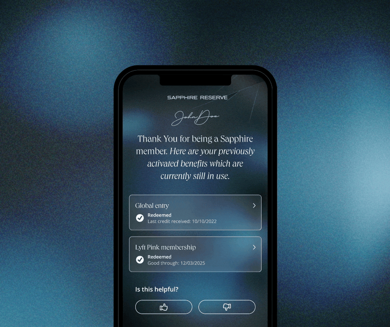
Previously Activated Benefits
During testing, many users misremembered when they activated a benefit. Legally, we could not repeatedly list multi-year benefits because it would be misleading to account for them twice.
We had to create a section to account for active benefits which were not tallied into the total.
The Results
The split test we conducted performed so well that we rolled out the feature to our general audience early. When compared to the control group, the variant saw lifts on multiple relevant KPIs. It has since gone on to successfully fulfill both our business and customer needs!